Case Study
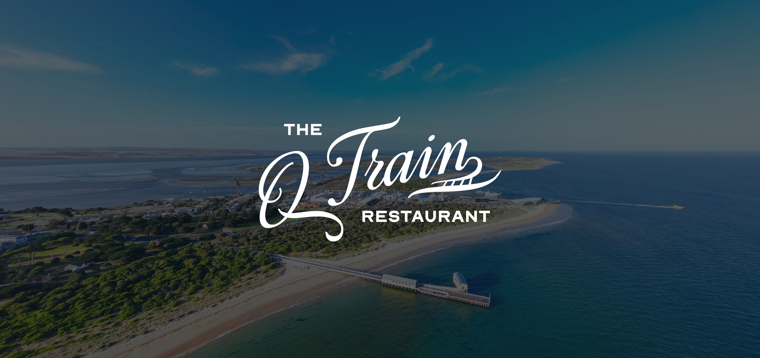
The Q Train
Restaurant
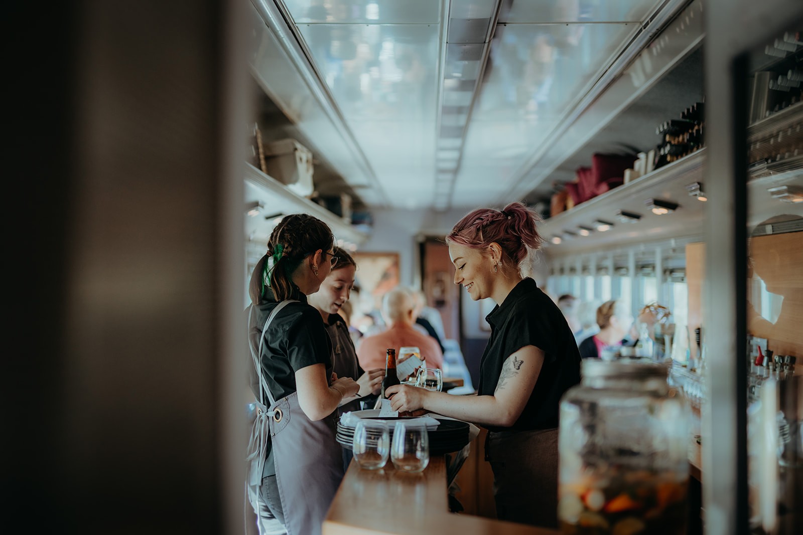
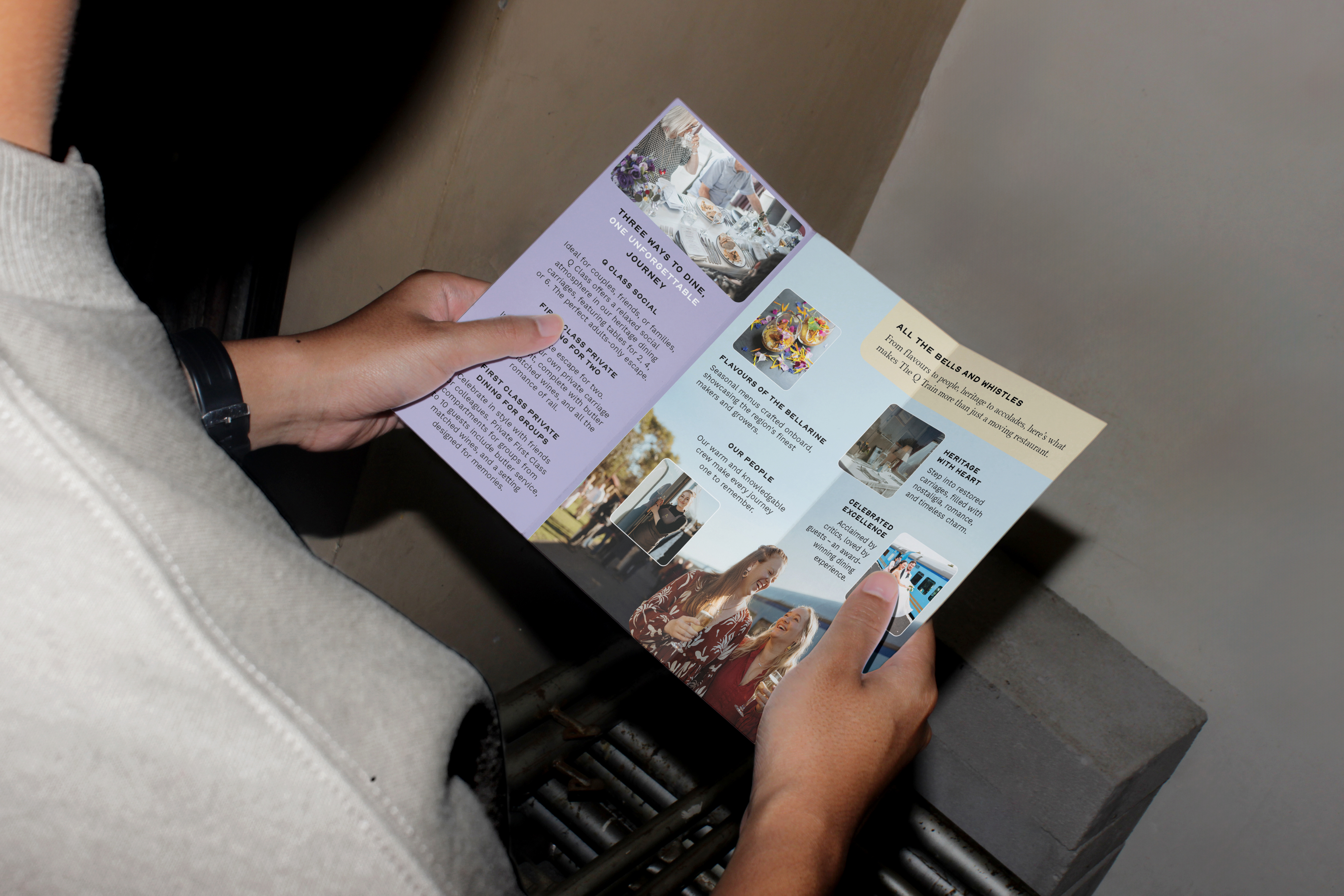
Engaged to evolve the brand of The Q Train, The 15thco delivered a considered end-to-end transformation.
Spanning a refined new logo, website, stationery suite, DL brochure, trade show presentation and bespoke carriage layout illustrations.
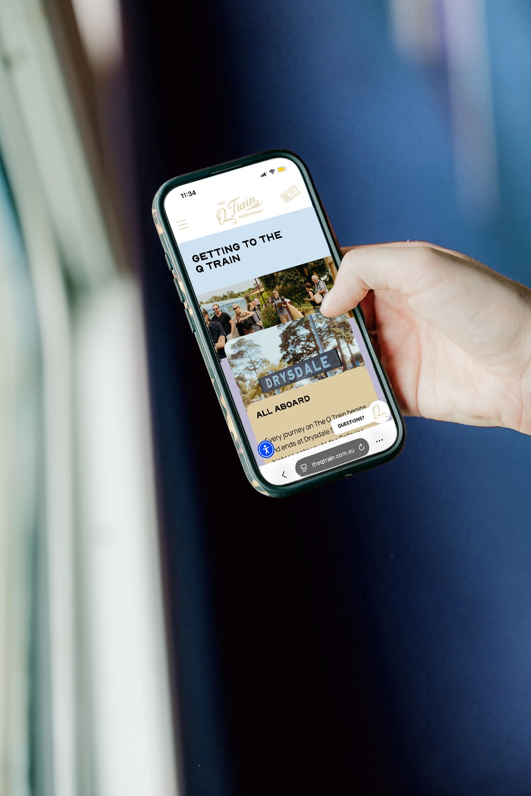
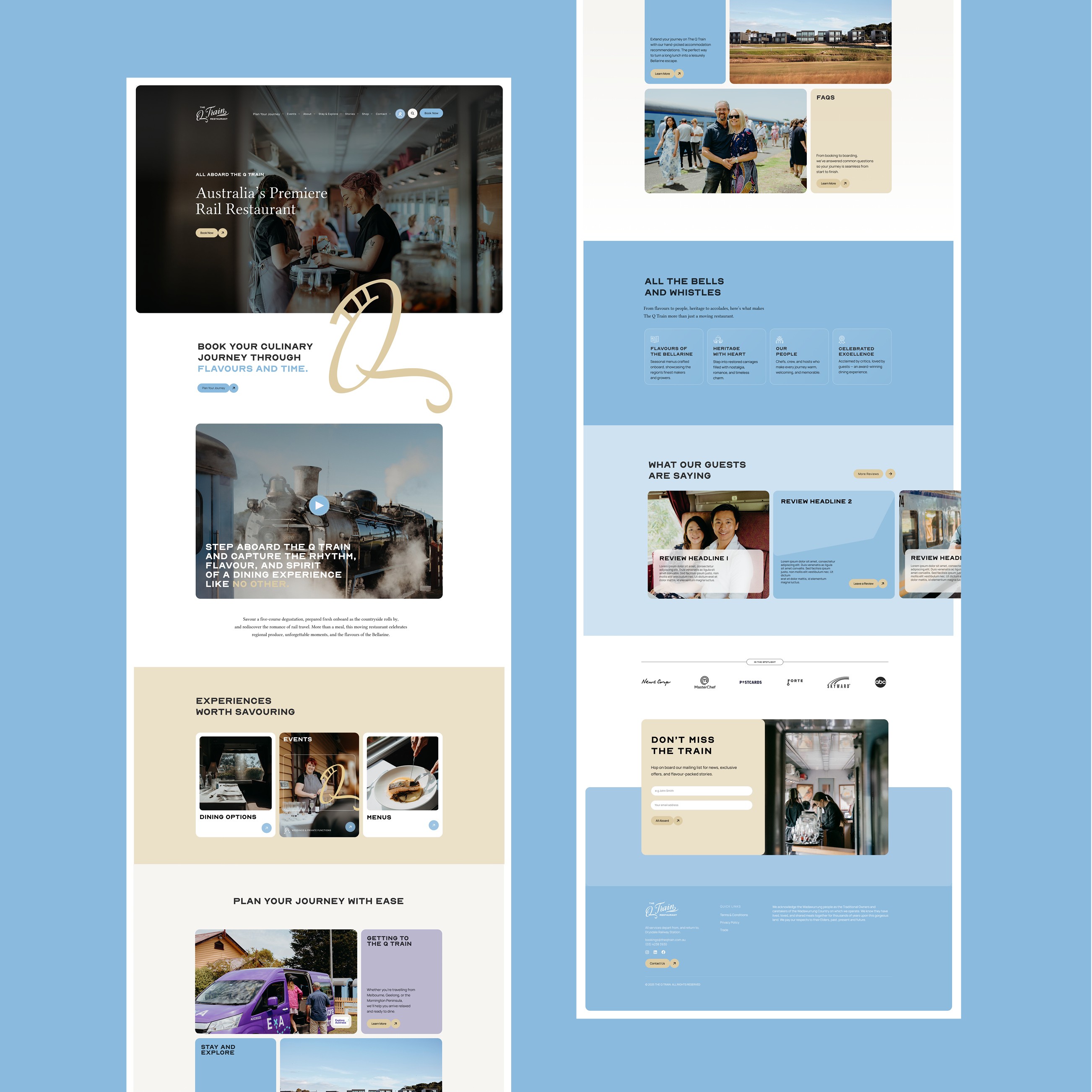
The website became central to the solution. Previously, the breadth of offerings - from private dining compartments to social carriages and events - created friction in the booking journey. We restructured the entire user experience, simplifying pathways and prioritising clarity without losing the magic of the experience. Intuitive navigation, clearer hierarchy and purposeful content ensured users could quickly understand their options and move seamlessly toward booking.
The result is a digital platform that doesn’t just inform, but guides, transforming a previously complex offering into an experience that feels effortless, elevated and unmistakably on track.
BrandingBrand PositioningStationery DesignPrint DesignWebsite DesignArt DirectionTrade Show PresentationIllustrations

Other Projects

It all starts here. Let’s connect.


OFFICE
Melbourne (Naarm) & Sydney (Cadigal Country)
CONTACT
+61 431 257 881
hello@the15thco.com
SOCIAL


Case Study
The Q Train
Restaurant
Engaged to evolve the brand of The Q Train, The 15thco delivered a considered end-to-end transformation.
Spanning a refined new logo, website, stationery suite, DL brochure, trade show presentation and bespoke carriage layout illustrations.
The website became central to the solution. Previously, the breadth of offerings - from private dining compartments to social carriages and events - created friction in the booking journey. We restructured the entire user experience, simplifying pathways and prioritising clarity without losing the magic of the experience. Intuitive navigation, clearer hierarchy and purposeful content ensured users could quickly understand their options and move seamlessly toward booking.
The result is a digital platform that doesn’t just inform, but guides, transforming a previously complex offering into an experience that feels effortless, elevated and unmistakably on track.
BrandingBrand PositioningStationery DesignPrint DesignWebsite DesignArt DirectionTrade Show PresentationIllustrations

Other Projects

It all starts here. Let’s connect.

OFFICE
Melbourne (Naarm) & Sydney (Cadigal Country)
CONTACT
+61 431 257 881
hello@the15thco.com
SOCIAL